
Housing Market Crash - Or Just A Correction In The USA? November 2025
- Rowena Patton
- Nov 3, 2025
- 29 min read

Updated: Jan 21

House listed and not selling? Check this post for killer strategies, whether you are in a declining, cresting or inclining market.
The Market Isn’t Crashing. It’s Cycling. Here’s What That Means for Home Sellers, Home Buyers and Investors.
Welcome to www.HousingFigures.com
You'll start to see it written about as a Housing Market Crash, as sometimes the alarming headlines bring more eyeballs. There's no need for alarm; simply an understanding of the leading indicators in your local market; which are evident when you know where to look.
Source: reventure, Nov 2025

In this article, you'll find National and local market price forecasts, as well as other data exploring whether the Housing Market Crash is on its way. From Carmel CA, to Asheville NC, we do a deep dive into different markets, as well as offering strategies to consider in the last drop down button.

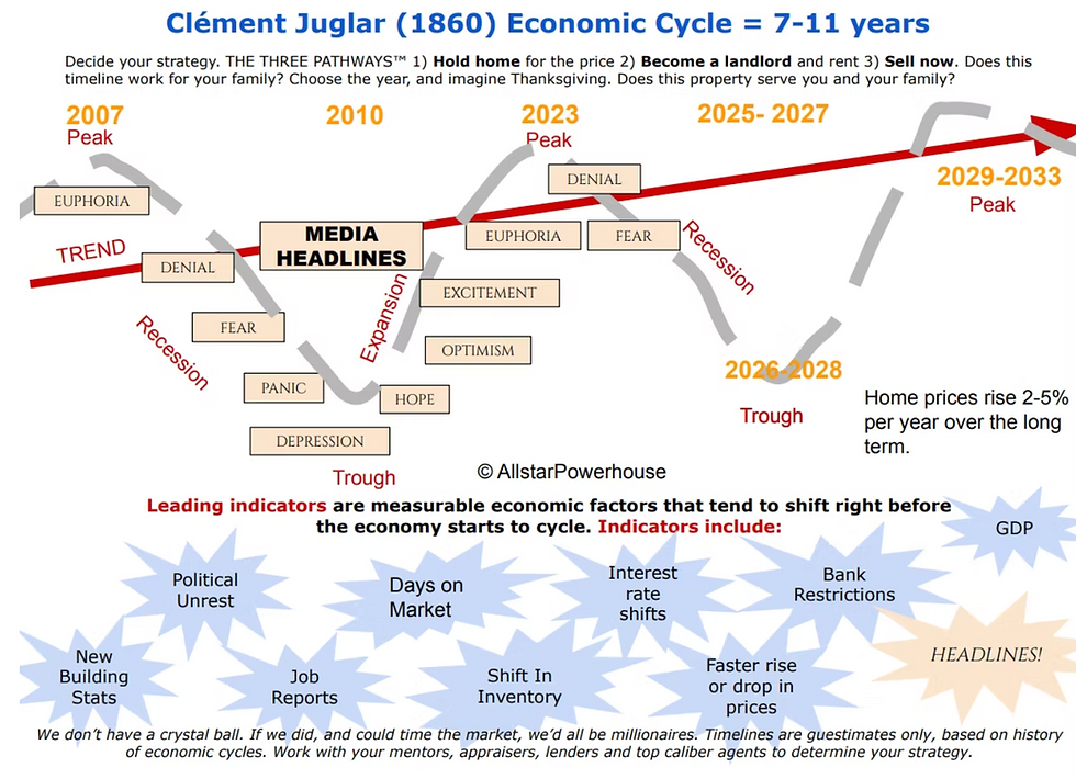
The real estate cycle is nothing new. Clément Juglar identified it back in 1860 as a 7–11 year cycle of economic ups and downs. This market is following that same historical pattern. Most of the country peaked in 2022–2023. A few states such as Illinois, Connecticut and New Jersey are still bumping along the top near their peaks, but for the many of us, we’re now deep into the correction phase.
Inventory has surged, price cuts are up, and sellers are adjusting to a more competitive environment. The headlines may call it a slowdown - or a crash depending on the source - but for those familiar with market cycles, this is exactly what a reset looks like.

In short: real estate is local, but pricing pressure is national. And right now, it’s leaning in favor of the buyer. Remember - although these figures are State-wide - your zip code may differ in increase or drop in forecast value. Headlines that scream Housing Market Crash don't help. Reach out for a deep dive on your zip code - and check out local areas below. House listed and not selling? Check this post for killer strategies, whether you are in a declining, cresting or inclining market.
CARMEL, CA
Carmel Home Forecast: November 2025 -

Source: Reventure Reach out for a deep dive on your zip code
Price Cuts: Percentage of Active Listings With Reductions

This chart shows the percentage of homes currently on the market that have taken at least one price reduction. It serves as a leading indicator of market direction. A higher percentage suggests that sellers are adjusting expectations; often due to fewer showings, longer days on market, or increased competition.
A lower percentage suggests stronger confidence among sellers; fewer feel the need to reduce to attract buyers.
These percentages are based on active listings, not closed sales. The homes shown here will typically close in the coming months, either at the reduced price or close to it. Tracking price cut trends helps reveal where pricing is heading before it appears in closed-sale data, making it one of the earliest signals of a changing market.
Investors and buyers watch these numbers closely to identify where they are most likely to secure stronger value or negotiate favorable terms. Sellers use this information to decide whether to:
Hold the property through the rest of the market cycle; referencing the Clement Juglar 7 to 11 year cycle
Price strategically to secure a sale now
Or rent the property and allow appreciation to build over time.
Understanding where your neighborhood falls on this chart can help guide your next step with clarity rather than guesswork.
Source: Reventure, November 2025
Reach out for a deep dive on your zip code
Affordability: Value to Income Ratio

This chart shows the Value / Income Ratio, which compares the typical home value in an area to the median household income. It indicates how attainable homeownership is for local buyers who live and work in the community. A higher ratio means homes are more expensive relative to income; a lower ratio means homes are more reasonably matched to what local households earn.
For context: our grandparents often purchased homes at an affordability ratio of 2 times household income. In other words, if the household earned $25,000, the home they purchased might have cost around $50,000. Many states in the center of the country still offer this 2 to 3 times ratio today. However, in many coastal and migration-attracting states, the ratio has climbed to 6, 7, or even 8 times household income.
This widening gap is what Nick Gerli, CEO of Reventure, refers to as “the worst affordability crisis in history.” When home values rise significantly faster than local incomes, the ability for people to live where they work is strained; this affects everything from neighborhood stability to school staffing, small business viability, and long-term civic growth.
Affordability trends also act as market direction indicators:
When the ratio moves higher, fewer local buyers can afford to purchase
This reduces demand and increases the risk of longer market times and potential price adjustments• When the ratio moves lower, local demand strengthens; this helps stabilize pricing and increase buyer activity
Understanding your local Value / Income Ratio is essential to planning your next move with clarity rather than sentiment or headlines.
Source: Zillow; US Census Bureau: November 2025
Reach out for a deep dive on your zip code Strategies in a Shifting Market
ASHEVILLE, NC
The Asheville, NC market is also experiencing a correction, although not as steep as in some of the more heavily affected regions across the country. Asheville tends to adjust more gradually because of its strong lifestyle appeal and its steady stream of relocation buyers. Between 40 percent and 60 percent of homebuyers in the Asheville area come from other markets, most often larger metropolitan areas. Many of these buyers have visited the region for years before choosing to purchase; Asheville has long been a place where people vacation, return to again and again, and eventually decide to retire or buy a second home.
In 2025, the tourism sector experienced a sharp decline, due mainly to Helene, when the region experienced catastrophic flooding. Homes, businesses, and lives were lost, and the recovery has taken time. The River Arts District, formerly the second most-visited area in Asheville and home to more than 350 working art studios, galleries, and creative small businesses, lost approximately 90 percent of its businesses, as many sat along the river. The Biltmore Estate, which has consistently ranked among the top three tourist destinations in the United States, also experienced a significant downturn in visitors as travel shifted and road access was impacted.
Asheville is located in Buncombe County, with Hendersonville to the south in Henderson County, and Waynesville to the west in Haywood County. Nearby communities including Black Mountain, Weaverville, Arden, and Fletcher each have their own micro-market conditions. Asheville is nationally known for its independent arts scene, music venues, farm-to-table restaurants, craft breweries, mountain views, and outdoor access.
Asheville offers a temperate four-season climate; spring and fall are especially popular, and summer temperatures are cooler than many Southeastern cities. Winter is typically mild. This climate, combined with mountain scenery, continues to attract retirees, remote workers, and second-home buyers.
2025 - 2026: Inventory has been increasing, and homes are not selling as quickly as they were during the peak pandemic-era relocation wave. Pricing is becoming more strategic. Some listings are requiring price adjustments to attract buyers who now have more choices across Buncombe County and surrounding areas.
The shift in market conditions means strategy matters more than it did during the automatic-offer years. Sellers can still achieve strong outcomes; however, accurate pricing, thoughtful preparation, and experienced guidance are essential to protecting equity. Buyers in turn are gaining more negotiation power and a wider selection of homes.
Asheville Home Forecast: November 2025 - Source: Reventure Reach out for a deep dive on your zip code

Table of the metro area - Nov 2025 - home price forecast

Price Cuts - % of current listings See price reductions on current listings

Price Cuts: Percentage of Active Listings With Reductions
This chart shows the percentage of homes currently on the market that have taken at least one price reduction. It serves as a leading indicator of market direction. A higher percentage suggests that sellers are adjusting expectations; often due to fewer showings, longer days on market, or increased competition. A lower percentage suggests stronger confidence among sellers; fewer feel the need to reduce to attract buyers.
These percentages are based on active listings, not closed sales. The homes shown here will typically close in the coming months, either at the reduced price or close to it. Tracking price cut trends helps reveal where pricing is heading before it appears in closed-sale data, making it one of the earliest signals of a changing market.
Investors and buyers watch these numbers closely to identify where they are most likely to secure stronger value or negotiate favorable terms. Sellers use this information to decide whether to:
Hold the property through the rest of the market cycle; referencing the Clement Juglar 7 to 11 year cycle
Price strategically to secure a sale now
Or rent the property and allow appreciation to build over time.
Understanding where your neighborhood falls on this chart can help guide your next step with clarity rather than guesswork. Source: Reventure, November 2025
Reach out for a deep dive on your zip code

Affordability: Value to Income Ratio
This chart shows the Value / Income Ratio, which compares the typical home value in an area to the median household income. It indicates how attainable homeownership is for local buyers who live and work in the community. A higher ratio means homes are more expensive relative to income; a lower ratio means homes are more reasonably matched to what local households earn.
For context: our grandparents often purchased homes at an affordability ratio of 2 times household income. In other words, if the household earned $25,000, the home they purchased might have cost around $50,000. Many states in the center of the country still offer this 2 to 3 times ratio today. However, in many coastal and migration-attracting states, the ratio has climbed to 6, 7, or even 8 times household income.
This widening gap is what Nick Gerli, CEO of Reventure, refers to as “the worst affordability crisis in history.” When home values rise significantly faster than local incomes, the ability for people to live where they work is strained; this affects everything from neighborhood stability to school staffing, small business viability, and long-term civic growth.
Affordability trends also act as market direction indicators:
When the ratio moves higher, fewer local buyers can afford to purchase
This reduces demand and increases the risk of longer market times and potential price adjustments• When the ratio moves lower, local demand strengthens; this helps stabilize pricing and increase buyer activity
Understanding your local Value / Income Ratio is essential to planning your next move with clarity rather than sentiment or headlines.
Source: Zillow; US Census Bureau: November 2025
Reach out for a deep dive on your zip code
Strategies in a Shifting Market
CHARLOTTE, NC
The Charlotte, NC market is experiencing a correction, though not as sharply as some of the more heavily impacted regions in the country. It is still feeling the influence of national trends; particularly from the continued flow of buyers relocating from higher-cost states. Many of these buyers are selling in markets where prices have softened; they often arrive with reduced purchasing power compared to a few years ago. This shift is affecting local pricing strategies, appraisal outcomes, and how both buyers and sellers negotiate.
Charlotte is located in Mecklenburg County, with nearby communities such as Huntersville and Cornelius to the north, Gastonia in Gaston County to the west, and Matthews and Waxhaw in Union County to the southeast. Charlotte is recognized as the second-largest banking and financial center in the United States, behind only New York City. The presence of Bank of America, Truist headquarters, and major Wells Fargo operations has driven decades of population growth, business relocation, and stable employment opportunities.
Charlotte also offers a temperate four-season climate; mild winters and warm summers make outdoor living and recreation appealing throughout the year. Its central location provides easy access to both the NC coast to the east and the Blue Ridge Mountains to the west. It is also only a couple of hours from the popular mountain city of Asheville, NC; giving residents convenient weekend access to hiking, restaurants, craft breweries, music, and arts. This balance of career opportunity and lifestyle continues to draw new residents from across the country.
2025 - 2026 - Inventory is building, and homes are no longer selling as quickly as they were during the peak of the pandemic-era surge.
The shift in market conditions means strategy matters more than it did during the automatic-offer period of recent years. Sellers can still achieve strong results; however, correct pricing out of the gate, thoughtful presentation, and experienced guidance are now key to protecting equity and reducing the risk of unnecessary price cuts. Buyers of course, are getting better deals.Charlotte
Home Forecast: November 2025, source ReventureReach out for a deep dive on your zip code


Price Cuts: Percentage of Active Listings With Reductions

This chart shows the percentage of homes currently on the market that have taken at least one price reduction. It serves as a leading indicator of market direction. A higher percentage suggests that sellers are adjusting expectations; often due to fewer showings, longer days on market, or increased competition.
A lower percentage suggests stronger confidence among sellers; fewer feel the need to reduce to attract buyers.
These percentages are based on active listings, not closed sales. The homes shown here will typically close in the coming months, either at the reduced price or close to it. Tracking price cut trends helps reveal where pricing is heading before it appears in closed-sale data, making it one of the earliest signals of a changing market.
Investors and buyers watch these numbers closely to identify where they are most likely to secure stronger value or negotiate favorable terms. Sellers use this information to decide whether to:
Hold the property through the rest of the market cycle; referencing the Clement Juglar 7 to 11 year cycle
Price strategically to secure a sale now
Or rent the property and allow appreciation to build over time.
Understanding where your neighborhood falls on this chart can help guide your next step with clarity rather than guesswork. Source: Reventure, November 2025
Reach out for a deep dive on your zip code

Affordability: Value to Income Ratio
This chart shows the Value / Income Ratio, which compares the typical home value in an area to the median household income. It indicates how attainable homeownership is for local buyers who live and work in the community. A higher ratio means homes are more expensive relative to income; a lower ratio means homes are more reasonably matched to what local households earn.
For context: our grandparents often purchased homes at an affordability ratio of 2 times household income. In other words, if the household earned $25,000, the home they purchased might have cost around $50,000. Many states in the center of the country still offer this 2 to 3 times ratio today. However, in many coastal and migration-attracting states, the ratio has climbed to 6, 7, or even 8 times household income.
This widening gap is what Nick Gerli, CEO of Reventure, refers to as “the worst affordability crisis in history.” When home values rise significantly faster than local incomes, the ability for people to live where they work is strained; this affects everything from neighborhood stability to school staffing, small business viability, and long-term civic growth.
Affordability trends also act as market direction indicators:
When the ratio moves higher, fewer local buyers can afford to purchase
This reduces demand and increases the risk of longer market times and potential price adjustments• When the ratio moves lower, local demand strengthens; this helps stabilize pricing and increase buyer activity
Investors and buyers monitor affordability to determine where long-term value and sustainable demand are most likely to hold. Sellers use this information to decide whether to:
Hold the property through the rest of the market cycle; referencing the Clement Juglar 7 to 11 year cycle• Price strategically to attract the current buyer pool• Or rent the property and allow time and equity growth to work in their favor
Understanding your local Value / Income Ratio is essential to planning your next move with clarity rather than sentiment or headlines.
Source: Zillow; US Census Bureau: November 2025 Reach out for a deep dive on your zip code Strategies in a Shifting Market
MORRISTOWN, NJ
The Morristown, NJ market remains stable and resilient, with many neighborhoods still experiencing steady demand and upward pricing pressure. While national narratives often focus on market slowdowns, Morristown has continued to benefit from strong local employment, commuter access to New York City, and ongoing relocation demand. The data in this forecast shows relatively low price-cut percentages, which is an early indicator that sellers here have more confidence and homes are still being absorbed without significant downward pressure.
A substantial share of Morristown buyers originate from outside the immediate area, particularly New York City, Hoboken, Jersey City, and other dense metro locations. In several Morris County zip codes, 40 percent or more of buyers are relocating into the area, often drawn to Morristown's balance of suburban living, walkability, transit access, and culture. This inflow continues to support pricing stability even as other markets soften.
Morristown is located in Morris County, surrounded by Mendham, Morris Plains, Florham Park, Madison, Chatham, and Harding, each with unique school districts, character, and price points. The town is known for its historic downtown, broad restaurant scene, the Morristown Green, and the Mayo Performing Arts Center. The local employment base includes healthcare through Morristown Medical Center, corporate headquarters, financial services, biotech, and technology firms.
The region offers four-season living, abundant parks and trails, and quick access to both New York City and the mountains of Northwest New Jersey. This blend of convenience and lifestyle continues to attract young professionals, families, and retirees seeking quality of life with strong long-term property value.
2025 - 2026: Inventory is rising gradually, but not at a pace that overwhelms demand. Buyers now have more choice than during the bidding-war years, but sellers who price correctly continue to secure strong offers. The data suggests a balanced-to-slightly seller-favorable market, rather than a correction. In many zip codes, value forecasts remain positive.
This means strategy still matters:
Sellers who prepare and price well can achieve strong equity protection
Buyers have more ability to negotiate, compare options, and take their time
Investors watch this region for long-term stability rather than distressed deals
Morristown Area Home Forecast: November 2025
Source: Reventure Analytics

Reach out for a deep dive on your zip code
For reference, here is NY

Price Cuts: Percentage of Active Listings With Reductions
This chart shows the percentage of homes currently on the market that have taken at least one price reduction. It serves as a leading indicator of market direction. A higher percentage suggests that sellers are adjusting expectations; often due to fewer showings, longer days on market, or increased competition.
A lower percentage suggests stronger confidence among sellers; fewer feel the need to reduce to attract buyers.
These percentages are based on active listings, not closed sales. The homes shown here will typically close in the coming months, either at the reduced price or close to it. Tracking price cut trends helps reveal where pricing is heading before it appears in closed-sale data, making it one of the earliest signals of a changing market.
Investors and buyers watch these numbers closely to identify where they are most likely to secure stronger value or negotiate favorable terms. Sellers use this information to decide whether to:
Hold the property through the rest of the market cycle; referencing the Clement Juglar 7 to 11 year cycle
Price strategically to secure a sale now
Or rent the property and allow appreciation to build over time.
Understanding where your neighborhood falls on this chart can help guide your next step with clarity rather than guesswork. Source: Reventure, November 2025

Reach out for a deep dive on your zip code
Affordability: Value to Income Ratio
This chart shows the Value / Income Ratio, which compares the typical home value in an area to the median household income. It indicates how attainable homeownership is for local buyers who live and work in the community. A higher ratio means homes are more expensive relative to income; a lower ratio means homes are more reasonably matched to what local households earn.
For context: our grandparents often purchased homes at an affordability ratio of 2 times household income. In other words, if the household earned $25,000, the home they purchased might have cost around $50,000. Many states in the center of the country still offer this 2 to 3 times ratio today. However, in many coastal and migration-attracting states, the ratio has climbed to 6, 7, or even 8 times household income.
This widening gap is what Nick Gerli, CEO of Reventure, refers to as “the worst affordability crisis in history.” When home values rise significantly faster than local incomes, the ability for people to live where they work is strained; this affects everything from neighborhood stability to school staffing, small business viability, and long-term civic growth.
Affordability trends also act as market direction indicators:
When the ratio moves higher, fewer local buyers can afford to purchase
This reduces demand and increases the risk of longer market times and potential price adjustments• When the ratio moves lower, local demand strengthens; this helps stabilize pricing and increase buyer activity
Understanding your local Value / Income Ratio is essential to planning your next move with clarity rather than sentiment or headlines.
Source: Zillow; US Census Bureau: November 2025

NY for Reference Strategies in a Shifting Market

LOGAN, UT
Logan UT Home Forecast: November 2025 - Source: Reventure Reach out for a deep dive on your zip code

The Logan, UT market is entering a period of price softening, with several neighborhoods projected to see declines rather than continued appreciation. While Logan experienced strong demand during the relocation surge of recent years, the market is now adjusting as that wave slows. The region still benefits from the presence of Utah State University, outdoor recreation access, and a strong community identity; however, the data indicates that pricing has begun to recalibrate downward as inventory grows and fewer buyers are competing for available homes.
Between 35 percent and 55 percent of buyers in Logan and the wider Cache County area typically come from other markets, including Salt Lake City, Idaho, and larger western metro areas. During the pandemic-era relocation cycle, this inflow pushed demand and pricing well above long-term historical norms. As those sending markets have cooled and affordability pressures have increased, many of those buyers now arrive with reduced purchasing power. The result is a shift in pricing behavior and negotiation leverage.
Logan sits in Cache County, bordered by North Logan, Hyde Park, Smithfield, Hyrum, Wellsville, and Providence. The town is known for its university culture, performing arts, agriculture-based economy, and direct access to Logan Canyon and the route to Bear Lake. The area offers four-season living, from snowy winters to cool mountain summers, and has traditionally attracted outdoor enthusiasts and families seeking space and a slower pace.
2025 - 2026: The map above shows forecasted price declines in multiple zip codes. These are early indicators of market cooling. Listings are expected to take longer to sell. Some homes will require price adjustments to compete. Buyers are gaining negotiation power, especially in properties that were priced assuming last year's demand conditions.
This means timing and strategy are essential:• Sellers should evaluate whether to sell now, hold through the Clement Juglar 7 to 11 year cycle, or rent the property to allow time for recovery• Buyers are positioned to secure better terms; less competition allows for careful selection• Investors watch this market for opportunities where pricing overshoots downward and later normalizes
Understanding the specific zip code pattern is critical, because forecast trends vary sharply across Cache Valley.
Reach out for a deep dive on your zip code
Price Cuts: Percentage of Active Listings With Reductions

This chart shows the percentage of homes currently on the market that have taken at least one price reduction. It serves as a leading indicator of market direction. A higher percentage suggests that sellers are adjusting expectations; often due to fewer showings, longer days on market, or increased competition. A lower percentage suggests stronger confidence among sellers; fewer feel the need to reduce to attract buyers.
These percentages are based on active listings, not closed sales. The homes shown here will typically close in the coming months, either at the reduced price or close to it. Tracking price cut trends helps reveal where pricing is heading before it appears in closed-sale data, making it one of the earliest signals of a changing market.
Investors and buyers watch these numbers closely to identify where they are most likely to secure stronger value or negotiate favorable terms. Sellers use this information to decide whether to:
Hold the property through the rest of the market cycle; referencing the Clement Juglar 7 to 11 year cycle
Price strategically to secure a sale now
Or rent the property and allow appreciation to build over time.
Understanding where your neighborhood falls on this chart can help guide your next step with clarity rather than guesswork.Source: Reventure, November 2025
Reach out for a deep dive on your zip code
Affordability: Value to Income Ratio

This chart shows the Value / Income Ratio, which compares the typical home value in an area to the median household income. It indicates how attainable homeownership is for local buyers who live and work in the community. A higher ratio means homes are more expensive relative to income; a lower ratio means homes are more reasonably matched to what local households earn.
For context: our grandparents often purchased homes at an affordability ratio of 2 times household income. In other words, if the household earned $25,000, the home they purchased might have cost around $50,000. Many states in the center of the country still offer this 2 to 3 times ratio today. However, in many coastal and migration-attracting states, the ratio has climbed to 6, 7, or even 8 times household income.
This widening gap is what Nick Gerli, CEO of Reventure, refers to as “the worst affordability crisis in history.” When home values rise significantly faster than local incomes, the ability for people to live where they work is strained; this affects everything from neighborhood stability to school staffing, small business viability, and long-term civic growth.
Affordability trends also act as market direction indicators:
When the ratio moves higher, fewer local buyers can afford to purchase
This reduces demand and increases the risk of longer market times and potential price adjustments• When the ratio moves lower, local demand strengthens; this helps stabilize pricing and increase buyer activity
Understanding your local Value / Income Ratio is essential to planning your next move with clarity rather than sentiment or headlines.
Source: Zillow; US Census Bureau: November 2025
Reach out for a deep dive on your zip code Strategies in a Shifting Market
HOOPER, UT
The Hooper, UT market is showing signs of softening, as the pace of demand has slowed compared to the relocation-driven surge of recent years. While Hooper and the wider Weber County area continue to attract buyers who value space, privacy, and quieter residential living, the market is now adjusting as affordability pressures and shifting buyer patterns influence purchasing decisions.
Hooper is located in Weber County, west of Roy, West Haven, and Clinton, with Antelope Island State Park and the Great Salt Lake to the southwest. The area is known for larger residential lots, agricultural heritage, open skies, and a slower suburban-rural blend of lifestyle. Many residents live in Hooper for its balance of access to Ogden and Salt Lake City employment centers while maintaining space and privacy.
A notable share of buyers in this region come from other parts of Utah and surrounding states, often seeking more land, lower density living, or the ability to work remotely. During the pandemic-era migration cycle, this inflow increased pricing and demand. As those conditions have eased, pricing is now recalibrating to reflect the current buyer pool.
2025 - 2026: The forecast map shows downward price pressure across multiple Hooper and Weber County zip codes. Homes are expected to take longer to sell, and some listings will require strategic pricing adjustments to attract qualified buyers. Buyers are gaining more negotiation room, and patience in the market has increased.
This means strategy is important on both sides:• Sellers should decide whether to sell now, hold through the Clement Juglar 7 to 11 year cycle, or consider renting• Buyers have increased leverage and can evaluate multiple options before making decisions• Investors monitor the region for opportunities to buy at stabilized values and hold for long-term growth.
Hooper Home Forecast: November 2025 - Source: Reventure
Reach out for a deep dive on your zip code

Price Cuts: Percentage of Active Listings With Reductions

This chart shows the percentage of homes currently on the market that have taken at least one price reduction. It serves as a leading indicator of market direction. A higher percentage suggests that sellers are adjusting expectations; often due to fewer showings, longer days on market, or increased competition. A lower percentage suggests stronger confidence among sellers; fewer feel the need to reduce to attract buyers.
These percentages are based on active listings, not closed sales. The homes shown here will typically close in the coming months, either at the reduced price or close to it. Tracking price cut trends helps reveal where pricing is heading before it appears in closed-sale data, making it one of the earliest signals of a changing market.
Investors and buyers watch these numbers closely to identify where they are most likely to secure stronger value or negotiate favorable terms. Sellers use this information to decide whether to:
Hold the property through the rest of the market cycle; referencing the Clement Juglar 7 to 11 year cycle
Price strategically to secure a sale now
Or rent the property and allow appreciation to build over time.
Understanding where your neighborhood falls on this chart can help guide your next step with clarity rather than guesswork.Source: Reventure, November 2025
Reach out for a deep dive on your zip code
Affordability: Value to Income Ratio

This chart shows the Value / Income Ratio, which compares the typical home value in an area to the median household income. It indicates how attainable homeownership is for local buyers who live and work in the community. A higher ratio means homes are more expensive relative to income; a lower ratio means homes are more reasonably matched to what local households earn.
For context: our grandparents often purchased homes at an affordability ratio of 2 times household income. In other words, if the household earned $25,000, the home they purchased might have cost around $50,000. Many states in the center of the country still offer this 2 to 3 times ratio today. However, in many coastal and migration-attracting states, the ratio has climbed to 6, 7, or even 8 times household income.
This widening gap is what Nick Gerli, CEO of Reventure, refers to as “the worst affordability crisis in history.” When home values rise significantly faster than local incomes, the ability for people to live where they work is strained; this affects everything from neighborhood stability to school staffing, small business viability, and long-term civic growth.
Affordability trends also act as market direction indicators:
When the ratio moves higher, fewer local buyers can afford to purchase
This reduces demand and increases the risk of longer market times and potential price adjustments• When the ratio moves lower, local demand strengthens; this helps stabilize pricing and increase buyer activity
Understanding your local Value / Income Ratio is essential to planning your next move with clarity rather than sentiment or headlines.
Source: Zillow; US Census Bureau: November 2025
Reach out for a deep dive on your zip code Strategies in a Shifting Market
TOLLAND, CT
Tolland, CT Home Price Forecast
The latest home price forecast shows Tolland County holding a strong Sellers Market position into 2025. While the pace is no longer at the peak levels seen during 2021–2022, the region remains supply-constrained, and demand for homes in Tolland continues to outpace available inventory.
Homes that are priced correctly and presented well are still:
Selling quickly
At strong price points
With multiple buyers actively competing, particularly in move-in-ready homes, homes with land, and homes in high-demand school district pockets
Why This Area Remains Strong
Tolland, and the surrounding ZIP codes (06268, 06084, 06250, 06066, and neighboring markets) continue to attract:
Families prioritizing top-rated schools
Remote and hybrid workers seeking more space + privacy
Relocating buyers from higher-cost metro areas
These drivers remain in place, supporting ongoing price stability and upward pressure.
2025–2026 Forecast
The forecast suggests:
Moderate, healthy appreciation — not a spike, not a decline
A more measured pace of bidding (but competition remains)
Buyers need to be prepared and decisive, not rushed
This is what we call a strategic sellers market, not a distressed one and not a buyer-dominant one.
Positioning Strategy
Sellers benefit from preparing their home thoughtfully and pricing with the market, not ahead of it.
Buyers benefit from clarity and pre-approval readiness — but they also have room to evaluate, not panic.
Investors continue to watch Tolland closely due to steady rental demand and long-term value trends.

Price Cuts: Percentage of Active Listings With Reductions
This chart shows the percentage of homes currently on the market that have taken at least one price reduction. It serves as a leading indicator of market direction. A higher percentage suggests that sellers are adjusting expectations; often due to fewer showings, longer days on market, or increased competition. A lower percentage suggests stronger confidence among sellers; fewer feel the need to reduce to attract buyers.
These percentages are based on active listings, not closed sales. The homes shown here will typically close in the coming months, either at the reduced price or close to it. Tracking price cut trends helps reveal where pricing is heading before it appears in closed-sale data, making it one of the earliest signals of a changing market.
Investors and buyers watch these numbers closely to identify where they are most likely to secure stronger value or negotiate favorable terms. Sellers use this information to decide whether to:
Hold the property through the rest of the market cycle; referencing the Clement Juglar 7 to 11 year cycle
Price strategically to secure a sale now
Or rent the property and allow appreciation to build over time.
Understanding where your neighborhood falls on this chart can help guide your next step with clarity rather than guesswork.Source: Reventure, November 2025
Reach out for a deep dive on your zip code

There is a deficit of homes for sale compared to the average of years past

Source: Reventure

Nationwide Figures Showing a Housing Market Crash?
The National Picture – Home Price Forecasts Source: Reventure

The map above shows what’s happening:
Blue areas reflect declining home price forecasts. The darker the blue, the steeper the projected drop.
Red areas are holding near peak levels, with smaller increases than we’ve seen in recent years.
Here’s the big picture. You might be focused on your local market, but across the U.S., often 40–60% of buyers are coming from out of state. That matters, because if they’re selling in a declining market (which is often the case), their buying power in your market is likely reduced.
We’re just over the crest of Clément Juglar’s historical economic cycle, where prices can start falling faster. It’s a normal correction, not a crash. This shift creates opportunity, especially for buyers who aren’t also trying to sell in a weakening market.
In short: real estate is local, but pricing pressure is national. And right now, it’s leaning in favor of the buyer. Remember - although these figures are State-wide - your zip code may differ in increase or drop in forecast value.
Top 20 forecast to decline Nov 2025

Price drops are one of the most telling indicators to watch. When the percentage of listings with price reductions spikes well above historic norms, it signals a market shift. In many areas, we’re seeing 50% of active listings with a price drop, compared to the usual 10–20%. That’s not just a blip. In fact, these elevated price cuts have been happening for a year or more in many markets.
This matters because once these homes close, they’ll reset the comparable sales data lower. That directly affects appraisals, making it harder for future buyers to secure financing, especially if their offer doesn’t align with the new, lower comps. It’s a compounding effect that can stall deals and pressure pricing even further.
Percentage of Active Listings with Price Cuts

Source: Reventure
Red areas indicate a higher percentage of price cuts compared to previous years. Blue areas reflect more stable pricing.
Just when you thought it was safe to go back in the water, Zillow has launched a suggested offer platform for homes in certain regions. Many buyers are checking it out. If your home is currently listed, explore the 'explore offer strategies' section. For example, a home listed at $825,000 might have a suggested 'Strong' offer of $775,000, with Zillow estimating a winning chance of over 90%. If you're buying, make sure to work with an experienced real estate agent, as Zillow's suggestions may not accurately reflect your market; after all, you and your agent have actually been in the home. This is especially crucial in markets where homes are unique. Algorithms struggle to estimate the values of homes that differ from their neighbors or don't fit into the six common models built at that time.
This is an actual example of a post on Zillow on a listing that is listed at $825,000 - how would this affect your behaviour as a) the seller b) the home buyer viewing this listing

The Market Isn’t Crashing. It’s Cycling. Here’s What That Means for Home Sellers, Home Buyers and Investors
The real estate cycle is nothing new. Clément Juglar identified it back in 1860 as a 7–11 year cycle of economic ups and downs. This market is following that same historical pattern. Most of the country peaked in 2022–2023. A few states such as Illinois, Connecticut and New Jersey are still bumping along the top near their peaks, but for the many of us, we’re now deep into the correction phase.
Strategies In A Shifting Market
So, what’s the upshot of all this?
If you’re a seller in today’s market; especially in 2025, it’s time to act decisively.
Think of your listing like a seat at the best table in the casino. To win, you need strategy, speed, and positioning. Let the emotion go, and train your poker face to focus on your next great adventure; and chapter in life.
Price it right from day one. If you missed that mark while “testing the market,” it’s not too late, but time is working against you. If you're not getting at least one showing per week, it’s time to get aggressive. Ask your agent how many showings they’d expect for your price point, and adjust accordingly. In a declining market, waiting a month to react can cost you significantly more than adjusting week by week. Did you know you can do micro-drops?
Let's use a declining market for an example: in Asheville, NC, if your home is listed at $600,000 or more, is professionally photographed, and properly marketed, and you're still not seeing 1–2 showings per week - it’s time to drop the price by 5%, at least. That may feel dramatic, but you don’t have time to waste. The market will make the cut for you if you don’t do it first. Discuss with your agent.
If you have a recent appraisal, highlight it. Lead your listing description with “Priced below appraisal.” It doesn’t sound desperate; it sounds honest. And buyers are listening for that now more than ever. Never price your home 2% higher than you think you will take - that is old-fashioned real-estate thinking.
Talk to your agent about realistic showing expectations. Common sense says you should be seeing at least two per week. If you’re not, implement weekly price drops until showings return, then actually listen to the feedback you're getting. Best of all, celebrate when the offer comes in - and you get to move on! Or choose to hold out for another 10 years or so - after all, real estate tends to keep going up in value over time. Or you could rent it out.
Use an experienced agent. Use an experienced agent. The real estate industry sees more than 75% of new agents leave within the first few years. While it may look like “easy money” from the outside, every property sale is different and can present unexpected challenges. Agents who have sold 24+ homes per year, have years of experience, and have strong mentorship behind them are equipped to guide you safely through the process; whether the market is rising, declining, or cresting.
If you want to hear the real stories behind the transactions, you’re welcome to listen to our 14 years of real estate radio shows; there are plenty of lessons learned and cautionary tales. Many of the agents who entered the business within the last seven years have only known a rising market, where simply placing a sign in the yard and a lockbox on the door may have been enough. An experienced agent knows how to reduce stress and protect your equity in any market.
Know where the pressure is hitting hardest. Condos, townhomes, and higher-end properties in the top 10% of pricing tend to take the biggest hit in a downturn. If you're in one of these categories, and those markets - act quickly and strategically.
Avoid the “I’ll re-list next year” trap. If you’re reading this in 2025, look at Juglar’s cycle. Waiting a year could mean chasing the market down. If you're holding, have a 10-year mindset; not 10 months. This is the most common trap that Ro has watched since she started working in real estate in 2007.
Remember: it’s a two-sided market. If you’re selling and buying, the home you purchase is likely declining too. You can call us to check out that market and do a deep dive on current figures in any zip code in the USA. Motivated sellers are everywhere. Use that to your advantage.
Don’t get caught up in political noise. This isn’t about who's in office, it’s the natural part of an economic cycle. But this one is intensified by what Nick Gerli of Reventure calls the worst affordability crisis in U.S. history. Home prices have far outpaced wages in most markets.
Certify Pre-Own your home. Get an inspection, fix what you can, and disclose what you can’t. Transparency builds trust and reduces fallout. Buyers are nervous in this market, and marketing your home as Certified Pre-Owned can ease those anxieties. CPO Expert Agents are all over the USA, following a methodology that was created in the 2008 home crash. CPO is an effective process in declining and expanding markets. We hold webinars frequently to go over what this looks like, or find your agent here. PS - CPOexperts was launched in 2007, when the last market shift looked like 2025.
Get your full market offer. Enter your home at www.CashCPO.com for a full market offer.
Bottom line: Homes are still selling, but only the ones that compete. Actually this never changes - the better performing homes always demand more profit and sell faster. If you're serious about selling, now is the time to act. Stop waiting for the market to come back to you - it won’t. At least not for some years. If you are in an expanding market place, CPO your home for the best value, and reach out to us so we can look at the zip code where you are buying in the future. We can do a deep dive on zoom anywhere in the country! Give us a few details here and we'll get in touch right away.
Get your home sold so you can move on, whether that means spending time with grandkids, caring for aging parents, moving into Senior Living, upsizing for a new baby, or finally starting that next chapter. Whatever your reason, don’t let a stagnant listing hold you back. And if homes are still selling in a reasonable time in your market; CPO it for the best value and to reduce the chance of a fall out, which happens all too frequently. Find your agent.
In this market, price, presentation, and positioning aren’t optional, they’re everything. The homes that win are the ones that show well, are priced right, and adjust quickly when the market shifts.
Control what you can, make strategic moves, and don’t let time, or equity, slip away while you wait. Listen to all of these topics being covered in depth on our 13yr long Radio show. It's a rare thing to see a 'Housing Market Crash' and at the end of the day; real estate is LOCAL.
Reach out for a deep dive on your zip code
Check out expert programs to list your home
House Listed and Not Selling?
House listed and not selling? Check this post for killer strategies, whether you are in a declining, cresting or inclining market.
Types of homes first to feel the pressure
In a decline, the first types of homes that tend to feel the downward pricing pressure are a) Second homes b) Condos and Townhomes. Here's a picture in 2025 of a condo / townhome development in NC. The green homes are for sale, and the yellow homes are contingent. This is a common picture in a decline. Many don't consider that the HOA fee covers some insurance and definitely maintenance that you generally don't have to cover as the homeowner. Search condos and townhomes in your area on a site that will show you contingent or pending (under contract homes) so that you can compare the ratio in your area - or find your agent here and they will research for you. Use the link to put your community in to compare. You can see this live here

Reach out to have your area added! https://www.allstarcertified.com/contact.php